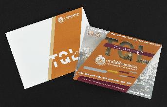
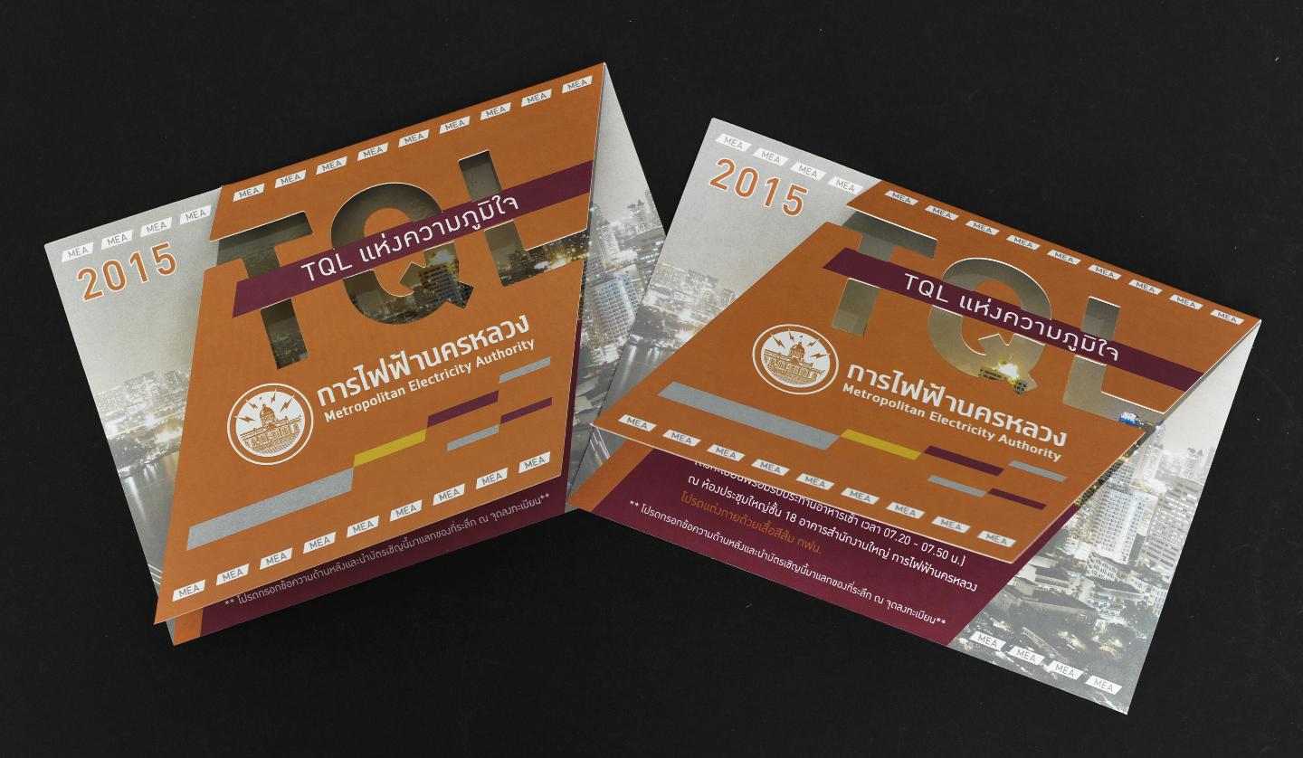
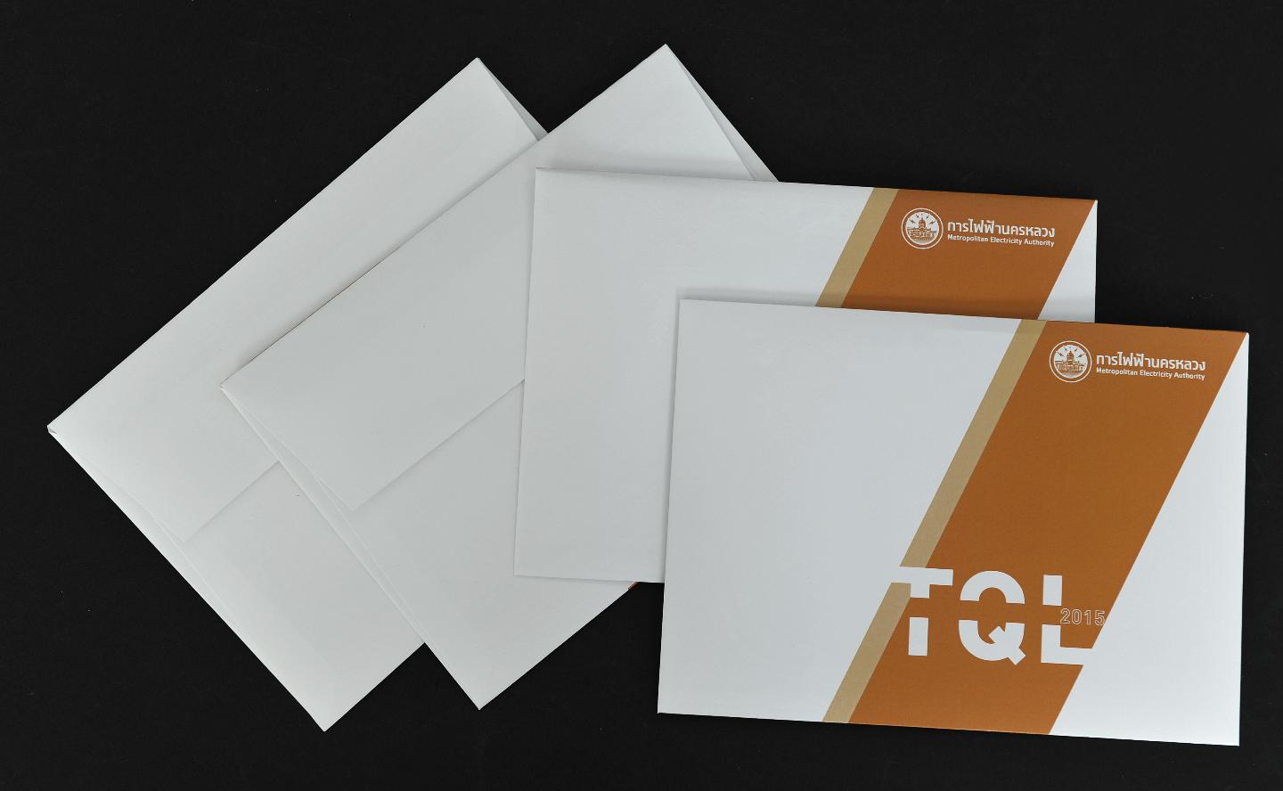
TQL Special Invitation Card for Metropolitan Electricity Authority
When Light Becomes the Art of Invitation
More Than an Invitation... It's a Tangible "Light Experience"
In the world of print media design, creating a standout invitation card is no simple task. But when Khun Oat, an exceptional designer, received the trust of Metropolitan Electricity Authority to design the TQL invitation card, the result was a perfect fusion of "cutting-edge printing technology" with "creative thinking that connects to organizational mission"
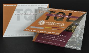
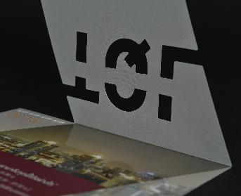
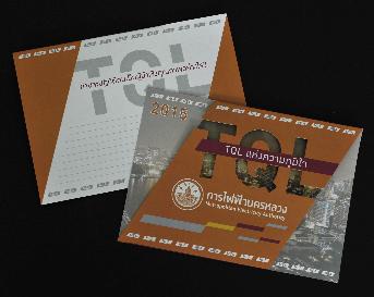
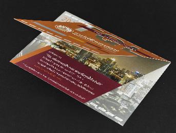
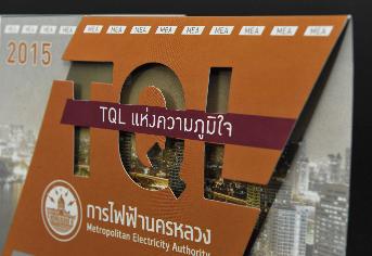
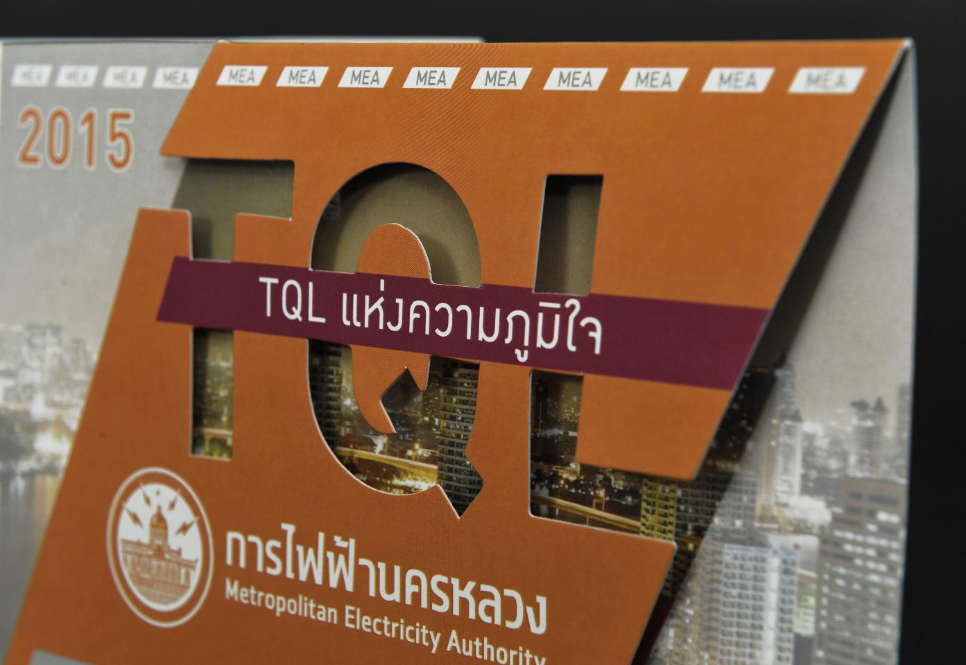
This card isn't just an invitation... it's a "Symbol of Light" that communicates the mission The die-cut TQL lettering that penetrates through the paper, combined with Spot UV technique that creates light-like shimmer, transforms this card into the perfect representative of Metropolitan Electricity Authority - the organization that brings light to people's lives.
The brilliance of this design lies in its deep understanding of "Brand DNA" Metropolitan Electricity Authority isn't just a utility provider, but a creator of light for people's lives. This invitation card doesn't merely invite - it communicates the profound story and meaning of the brand.

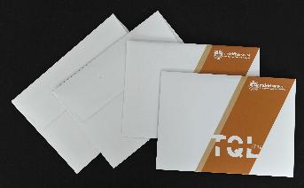
Premium Production Specifications
- Finished size 5 x 7 inches (17.7 x 12.6 cm)
- 350gsm art card paper
- Sharp 4-color digital printing, 2-sided
- Matte lamination on both sides
- Special Spot UV technique
- Die-cut TQL lettering through paper
- Center fold as card cover
- 120gsm bond paper envelope
Special Techniques That Create the Difference
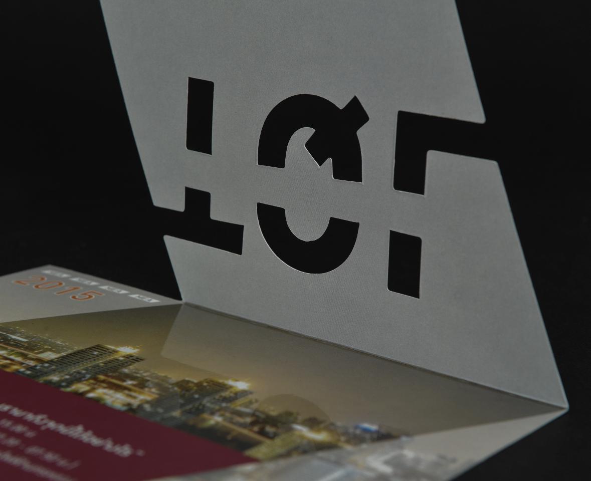
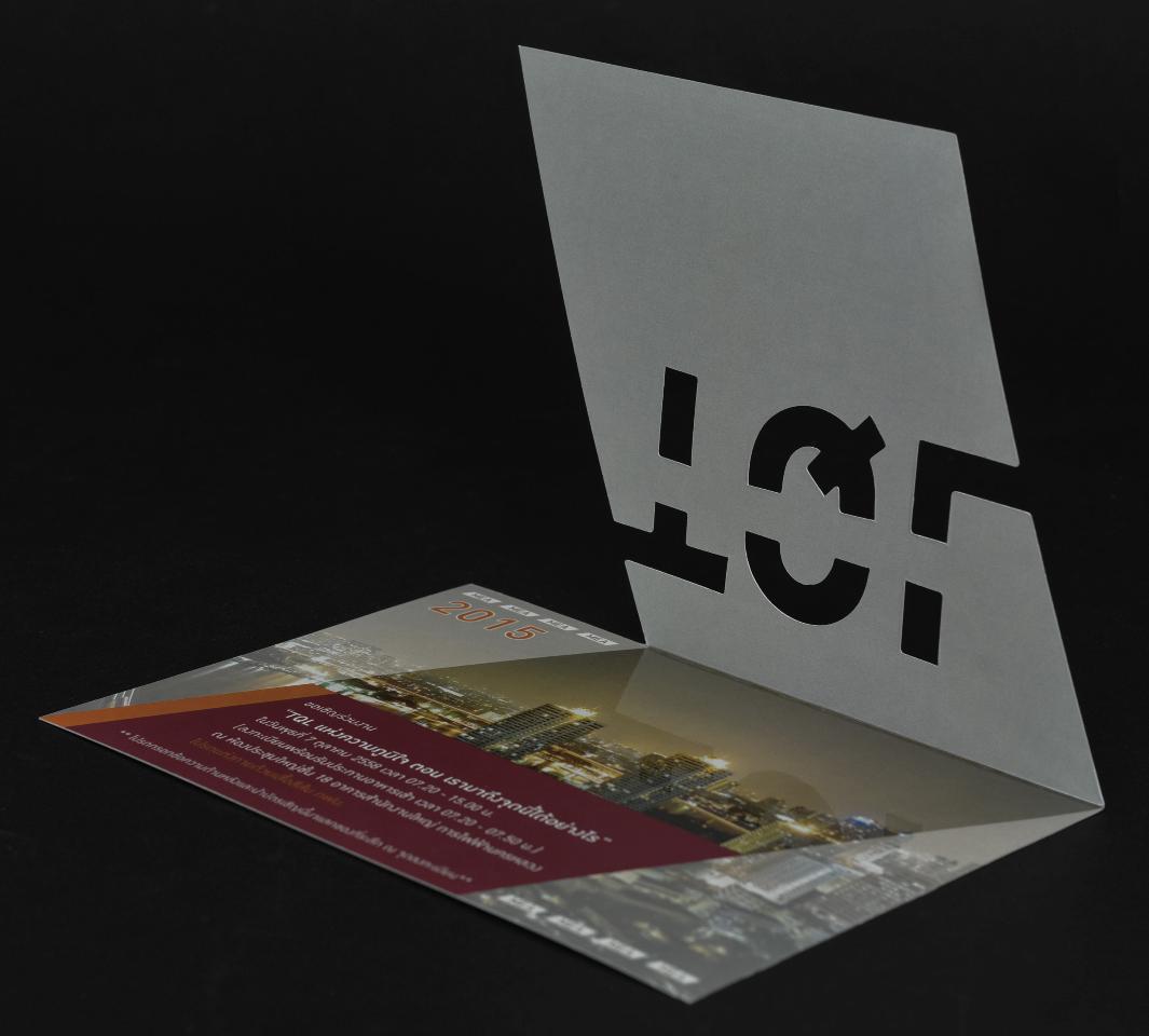
TQL Letter Die-Cutting
The technique of cutting through paper to form TQL letters not only creates beauty but also provides intelligent communication. When the card opens, light shines through the letter openings, creating light effects that align with the organization's mission.
Spot UV - Shimmering Innovation
UV coating applied specifically to building images inside the card creates glossy shine and slight raised texture, making it appear like glowing light. This technique not only adds beauty but cleverly reinforces the concept of illumination.
Symbolic Meaning
Light of Hope
The die-cut TQL allowing light to shine through represents how Metropolitan Electricity Authority brings light to communities, creating hope and improving quality of life.
Urban Progress
The Spot UV coated building image reflects urban development and strong infrastructure, representing sustainable growth and advancement.
Community Connection
The card that opens represents opening opportunities, connecting community members through various projects and activities.
Real Results Achieved
Maximum Impression
Invitation recipients had a 95% attendance rate due to the card's uniqueness creating curiosity and special feelings about the event.
Social Media Sharing
This card went viral on social media due to its novelty that made people want to photograph and share it, expanding brand visibility widely.
Behind the Design Process
Brand Analysis
Study the mission and values of Metropolitan Electricity Authority to create designs that communicate precisely.
Ideation
Develop the "light" concept as the core design philosophy, connecting it with appropriate production techniques.
Technique Selection
Determine the use of die-cutting and Spot UV to create light effects that align with the design concept.
Production & Completion
Meticulous production with quality checks at every step until achieving the perfect card.
Perfect for Special Occasions
Invitation Card Design Trends 2025
Die-Cut Storytelling
Die-cutting not only creates beauty but serves as a storytelling tool that communicates deep messages effectively.
Multi-Sensory Experience
Combining multiple techniques like die-cutting + Spot UV to create diverse dimensional tactile experiences.
Meaningful Design
Designs with meaning that connect to brand identity - not only beautiful but also intelligently communicative.
Expert Recommendations
Effective Design Principles
- Understand the Brand: Study organizational identity and values deeply
- Choose Appropriate Techniques: Use techniques that support design concepts
- Consider Recipients: Design to create desired emotions and feelings
- High Quality: Select the best materials and production processes
Production Techniques to Know
- Die-Cutting: Plan cuts that don't destroy card structure
- Spot UV: Select emphasis points strategically
- Folding: Calculate folds precisely for perfect opening-closing
- Envelopes: Design envelopes to match cards and create good experience
Business Benefits
Increased Response Rate: 90-95% compared to ordinary cards at 60-70%
Enhanced Brand Recognition: Special experiences create 3-5x longer memory retention
Improved Image: Communicates professionalism and attention to detail
Social Media Sharing: Uniqueness stimulates photo sharing
High ROI: Quality investment yields tremendous returns
Lasting Impression: Becomes a keepsake that recipients treasure
Success Stories
"The TQL invitation card didn't just invite people to the event, but also perfectly represented our organization and communicated our values. Every recipient was impressed and asked where it was made."
"As a designer, I'm proud to have participated in creating this piece. It's a great example of how modern printing can tell stories and communicate powerfully."
The Meaning of Collaboration
Trust
Metropolitan Electricity Authority chose Set Square Ping Idea because they believed in our ability to transform concepts into reality.
Creativity
The fusion between designer vision and cutting-edge production technology.
Excellence
This card became an important example of printing that combines art with technology.
Ready to Create Invitation Cards That Tell Your Story?
Whether for corporate events, weddings, or any special occasion, we have the expertise to transform creative ideas into impressive print work that communicates effectively. With die-cutting, Spot UV, and other cutting-edge technologies at our disposal.
No minimum order! Starting from 50 pieces with free design consultation
Contact Your "Creative Partner" to Craft Your Project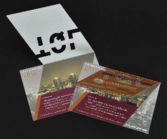

